Choosing the right paint colors for your space requires a deep understanding of color theory and paint swatches. Color theory is the cornerstone for selecting the perfect hue. Paint swatches serve as the essential tool for testing and confirming your color choice. By mastering color theory and using paint swatches effectively, you can make informed decisions. This will help you create a space that truly reflects your personality and style.
In this article, we’ll explore the realm of color theory and its application to paint colors. We’ll also discuss how to leverage paint swatches to your advantage. From identifying the various types of paint swatches to testing samples in your space, we’ll cover everything. By the end of this guide, you’ll have the knowledge and confidence to select the ideal paint colors for your space.
Key Takeaways
- Understanding color theory is essential for selecting the right paint colors
- Paint swatches are a crucial tool for testing and finalizing your paint color decision
- Color theory applies to paint colors and can help you create a harmonious space
- Testing paint samples in your space is vital for ensuring the color looks great in different lighting conditions
- Utilizing paint swatches and understanding color theory can help you make informed decisions about your paint colors
- Choosing the right paint color can greatly impact the overall aesthetic and feel of your space
The Basics of Paint Colors and Color Theory
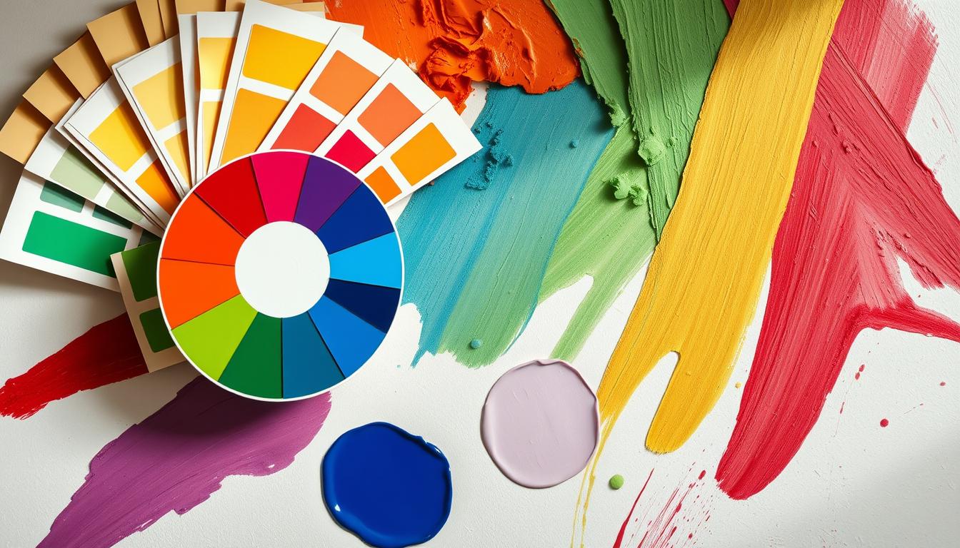
Grasping the basics of color theory is crucial for making smart choices about paint colors. Color theory is a set of principles aimed at creating harmonious color combinations. It helps us understand how colors interact with each other. At its heart, color theory revolves around the color wheel, a circular diagram of colors with primary colors at the center.
The color wheel categorizes colors into primary, secondary, and tertiary. Primary colors, like red, blue, and yellow, can’t be mixed from other colors. Secondary colors, such as green, orange, and purple, are the result of mixing two primary colors. Tertiary colors, created by blending primary and secondary colors, offer a vast array of hues and shades.
In color matching, it’s vital to consider each color’s undertones. These undertones can be warm or cool, significantly affecting a color’s appearance. Warm colors, such as red and orange, bring a sense of warmth and energy. Cool colors, like blue and green, create a calming atmosphere. By mastering color theory and matching, you can choose the ideal paint colors for your space.
Understanding Color Wheels and Schemes
- Primary colors: red, blue, and yellow
- Secondary colors: green, orange, and purple
- Tertiary colors: created by mixing primary and secondary colors
Primary, Secondary, and Tertiary Colors
Understanding the different color types and their interactions allows for creating a balanced color scheme. This enhances the beauty of your space.
How Light Affects Your Paint Colors
When picking paint colors, it’s crucial to think about the light effects in your area. Natural and artificial light can greatly change how paint colors appear. They might look different from the swatch or sample. Knowing how light impacts paint colors helps you make better choices and get the look you want.
To test paint colors, apply a sample to the wall and watch it under different lights. This helps you see how the color will look in your space. You can also use online tools or get advice from a pro to find the best color for your lighting.
- Natural light can make colors appear more vibrant and intense.
- Artificial light can make colors appear more muted and subdued.
- Lighting conditions can change throughout the day, so it’s essential to test paint colors at different times.
By understanding how light effects change your paint colors, you can achieve a beautiful and unified look in your space.
Understanding Paint Swatches and Color Cards
Paint swatches are crucial for picking the right paint color. These small paint samples let you see how a color will look on your wall before making a final choice. By using paint swatches and doing sample testing, you can pick a color that matches your furniture, flooring, and overall style.
There are various paint swatches available, including digital and physical ones. Digital paint swatches can be found online and let you see how a color will look on your wall virtually. Physical paint swatches, on the other hand, are small cards or strips of paint that you can hold up to your wall for a better color sense.
Different Types of Paint Swatches
- Digital paint swatches
- Physical paint swatches
- Paint sample cards
It’s also key to know how to read color codes. These codes are usually found on the back of a paint swatch and give details about the color’s shade and tone. Understanding color codes helps you make a more informed choice about which color to pick.
Using Digital vs. Physical Swatches
Digital and physical paint swatches each have their own advantages and disadvantages. Digital paint swatches are handy and accessible from anywhere, but they might not accurately represent the color. Physical paint swatches offer a more accurate color representation but can be more time-consuming to get. Using both digital and physical swatches can give you a clearer picture of the color and help you make a better choice.
| Type of Swatch | Benefits | Drawbacks |
|---|---|---|
| Digital | Convenient, accessible from anywhere | May not provide accurate representation of color |
| Physical | Provides accurate representation of color | May be more time-consuming to obtain |
The Psychology Behind Paint Colors
When choosing paint colors, we often focus on looks, but color psychology is crucial. The colors we pick can significantly affect our mood, emotions, and well-being. Understanding the psychology behind paint colors helps us create a positive atmosphere in our homes.
Research indicates that colors can elicit various emotions. Warm colors like orange and red boost energy and excitement. On the other hand, cool colors such as blue and green foster calmness and serenity. This knowledge aids in designing room-specific color schemes. For instance, a bedroom benefits from soothing colors for relaxation, while a home office thrives with stimulating colors for productivity.
Also, cultural color considerations shape our color preferences. Different cultures assign unique meanings to colors. Being mindful of these cultural nuances helps us make better color choices. By considering both psychological and cultural aspects of color, we can craft a welcoming space that mirrors our personality and style.
Colors and Mood Enhancement
- Warm colors: stimulate energy and excitement
- Cool colors: promote calmness and serenity
- Neutral colors: provide balance and stability
Room-Specific Color Recommendations
By applying color psychology principles, we can design a space that looks and feels wonderful. Whether aiming for relaxation, energy, or inspiration, the right color scheme is key. By taking into account the psychological and cultural aspects of color, we can make choices that enhance our home’s atmosphere.
Testing Paint Samples in Your Space
Choosing the perfect paint color requires sample testing. This step involves applying paint samples to your walls and assessing their appearance under various lighting conditions. It ensures the color will complement your space perfectly.
To initiate the sample testing process, pick a few paint colors you’re interested in and buy sample sizes. Paint a small area of your wall with each color. Observe their appearance at different times of day. Online tools can also aid in visualizing the colors in your space.
- Test the colors on multiple walls to see how they look from different angles.
- Observe the colors in different lighting conditions, including natural and artificial light.
- Consider the color of your furniture and decor when evaluating the paint samples.
By following these tips and taking the time to test paint samples in your space, you can make an informed decision. This way, you’ll choose a paint color that you’ll love for years to come.
Common Paint Color Selection Mistakes to Avoid
Choosing paint colors can be tricky, leading to less-than-ideal results if not done right. To ensure color matching and paint coordination success, it’s vital to recognize and sidestep common pitfalls.
One major blunder is overlooking undertones. These are the underlying hues within a color, greatly influencing how a room looks. For example, a color with cool undertones might seem blue or purple, while warm undertones could appear yellow or orange.
Common Mistakes to Watch Out For
- Ignoring undertones, which can affect the overall color appearance
- Skipping the sample testing phase, which can lead to unexpected results
- Forgetting about existing decor, which can clash with the new paint color
To sidestep these errors, it’s crucial to test paint samples in your space and think about your current decor. This approach ensures a cohesive paint coordination and guarantees the new color enhances the room’s look. By being cautious of these common mistakes and taking the right steps, you can achieve a harmonious color matching and enjoy a beautifully painted area.
By adhering to these guidelines and being aware of common pitfalls, you can make a successful paint color choice. This will help you achieve the desired look for your space.
| Mistake | Consequence | Solution |
|---|---|---|
| Ignoring undertones | Unpleasant color appearance | Test paint samples and consider undertones |
| Skipping sample testing | Unexpected results | Test paint samples in your space |
| Forgetting existing decor | Clashing colors | Consider existing decor when selecting paint color |
Coordinating Paint Colors Across Rooms
Choosing the right colors for paint coordination is key to a unified home atmosphere. It’s important to consider the space’s flow and how different rooms relate to each other. Think about how the colors will transition from one room to the next.
Begin with a neutral color scheme and introduce vibrant hues through furniture and decor. This strategy ensures a unified look across your home. Utilizing a color wheel can also help find complementary colors.
- Opt for colors with similar undertones for a cohesive feel.
- Take into account the natural light in each room and its impact on color.
- Experiment with different shades of the same color to add depth and interest.
By adhering to these guidelines and focusing on paint coordination, you can craft a stunning, harmonious space that showcases your personal style.
| Room | Color | Undertone |
|---|---|---|
| Living Room | Warm Beige | Yellow |
| Kitchen | Cool Gray | Blue |
| Bedroom | Soft Peach | Orange |
Understanding Paint Finishes and Their Impact
Choosing the right paint color involves more than just picking a shade. The finish is crucial, as it can make a color pop or blend into the background. In color theory, the finish can either amplify or diminish the color’s impact. It’s vital to grasp the various paint finishes and how they interact with paint swatches to make an informed choice.
The sheen level, ranging from matte to glossy, significantly influences color appearance. A glossy finish can intensify a color, while a matte finish softens it. This is key when applying color theory and paint swatches to achieve a unified look.
- Room usage: Different rooms demand different finishes. For instance, kitchens and bathrooms benefit from glossy finishes for easy cleaning. Bedrooms, on the other hand, might suit a matte finish better.
- Lighting: The room’s lighting, both natural and artificial, affects paint color appearance. Glossy finishes reflect light, enhancing color vibrancy. Matte finishes absorb light, resulting in a more subdued look.
- Personal preference: The final decision on paint finish hinges on personal taste. Some prefer the glossy look for its sleekness, while others opt for the understated elegance of matte.
By weighing these factors and understanding the interaction between paint finishes, color theory, and paint swatches, you can select the ideal finish for your space.
| Finish Type | Description | Recommended Use |
|---|---|---|
| Matte | A flat, non-reflective finish | Bedrooms, living rooms |
| Eggshell | A slightly reflective finish | Kitchens, bathrooms |
| Glossy | A highly reflective finish | Trim, doors, windows |
Professional Tips for Perfect Paint Colors
Choosing the right paint colors for your space involves understanding color psychology. Different hues can stir up various emotions and moods. It’s key to pick colors that match the room’s intended use. For instance, a serene blue is great for bedrooms, while a lively orange suits home offices.
Light effects also significantly influence paint color choices. Natural and artificial light can alter how colors appear in a room. Testing paint samples under different lighting conditions is crucial. This ensures the color looks excellent at all times and in various lighting scenarios.
To create a stunning paint color scheme, follow these tips:
* Test paint samples on different walls and at various times of the day
* Think about the color of furniture, flooring, and other decor
* Don’t hesitate to get advice from a painter or interior designer
* Consider the color psychology and light effects in your space for a cohesive, welcoming atmosphere.
Conclusion: Making Your Final Color Selection
As you conclude your color selection journey, remember it’s a blend of color theory, practicality, and personal taste. This article has provided insights on color wheels, schemes, and testing samples in your space. Now, you’re equipped to make a well-informed and confident choice.
When picking paint colors, consider how they impact a room’s mood and feel. Think about how light changes color appearance and ensure your choices flow well across your home. Above all, trust your instincts and select colors that truly speak to you and your design vision.
With the right paint coordination and creativity, you can turn any space into a personal sanctuary. Embrace the color selection process, enjoy the journey, and revel in the creation of your dream paint palette.